On Tap Kitchen Packaging Design
BRIEF
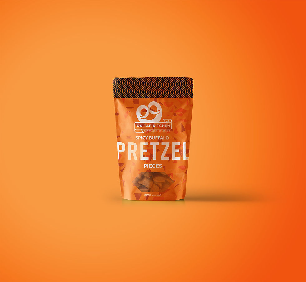
On Tap Kitchen partnered with Almanac to refresh their pretzel packaging—modernizing the design while maintaining the familiar look that loyal customers recognize. The goal: create a bold, colorful, and cohesive product line that stands out on the shelf without losing the special something that makes On Tap Kitchen stand out from the crowd.
By focusing on strategy before diving into aesthetics, the Almanac team developed a packaging system that strengthens On Tap Kitchen’s brand identity, enhances shelf presence, and ensures each flavor is instantly recognizable.
RESULT
-
Instantly recognizable. Working closely with the On Tap team, Almanac developed a unified design system that distinguishes each SKU, while ensuring that each product feels like part of the same family.
-
Built for growth. The updated packaging refines On Tap Kitchen’s brand elements, enhancing logo placement, typography, and layout for better visibility and impact and making it easy to add new flavors in the future.
-
Updating, not redesigning. We carefully balanced new ideas with familiar forms, ensuring the new packaging feels fresh and modern while remaining true to the huistory of the brand.
-
Strong shelf presence. The new design maximizes visibility, making it easier for customers to spot their favorite flavors at a glance.